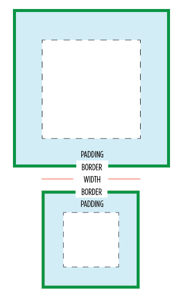
 One of my least favorite parts about layout with CSS is the relationship of width and padding. You’re busy defining widths to match your grid or general column proportions, then down the line you start to add in text, which necessitates defining padding for those boxes. And ‘lo and behold, you now are subtracting pixels from your original width so the box doesn’t expand.
Ugh. If I say the width is 200px, gosh darn it, it’s gonna be a 200px wide box even if I have 20px of padding. So as you know, this is NOT how the box model has worked for the past ten years. Wikipedia has a great history of this box model. Jeff Kaufman also dove into the history
Anyway, I have a recommendation for your CSS going forward:
1 2 3 4 5 6 7 | |
Update August 2014: This code was updated to match new box-sizing best practices. Also prefixes are pretty much dead.
This gives you the box model you want. Applies it to all elements. Turns out many browsers already use border-box for a lot of form elements (which is why inputs and textareas look diff at width:100%;) But applying this to all elements is safe and wise.
Browser support
Due to browser support, this recommendation is only for projects that support IE8 and up. (Full browser compat at MDN) Firefox <= 28 still needs the -moz- prefix, and <= iOS4, Android <= 2.3 need the -webkit-, but everyone else uses the unprefixed. You can find more info about a box-sizing polyfill for IE6 & 7 at html5please.com/#box-sizing (which was developed with * { box-sizing: border-box!).
Is it safe to use?
Totally. jQuery works pretty great with it (except this). As mentioned, browser support is excellent. And a number of projects use this layout model by default, including the WebKit Web Inspector (aka Chrome DevTools). I heard from Dutch front-end developer Yathura Thorn on his experience:
We’ve been using
*{box-sizing: border-box;}in one of my projects (deployed in production, averaging over 1mln visits a month) at work for about a year now, and it seems to be holding up just fine. The project has been tested in IE8 & 9 and the latests Firefox and Chrome versions and we’ve had no problems. All jQuery (+UI) offset calculations and animations run fine, even in any element we’ve displayed as inline-block. As of late we’ve started testing the project on mobile devices (iPhone, iPad and Android) and we’ve had no issues regarding box-sizing with any of them yet, so it seems to work just fine.
One of my favorite use-cases that border-box solves well is columns. I might want to divide up my grid with 50% or 20% columns, but want to add padding via px or em. Without CSS’s upcoming calc() this is impossible… unless you use border-box. So easy. :) Another good one is applying 100% width and then wanting to add a padding to that element.
Performance
Lastly on @miketaylr’s inquiry, I also tested perf overhead. Anecdotal evidence suggests border-box isn’t significant.
You might get up in arms about the universal * selector.
Apparently you’ve heard its slow. Firstly, it’s not. It is as fast as h1 as a selector. It can be slow when you specifically use it like .foo > *, so don’t do that. Aside from that, you are not allowed to care about the performance of * unless you concatenate all your javascript, have it at the bottom, minify your css and js, gzip all your assets, and losslessly compress all your images. If you aren’t getting 90+ Page Speed scores, it’s way too early to be thinking about selector optimization. See also: CSS Selector Performance has changed! (For the better) by Nicole Sullivan.
So… enjoy and hope you’ll find this a far more natural layout model.
Adjustments for Third Party Content
Any third party widgets add content directly into the page may need extra attention. Any widgets inside an iframe (like Disqus’s new theme) are naturally insulated from the parent page’s layout styles. If you need to make adjustments to the third party content you can apply box-sizing: content-box; to the widget and its descendants. This may not be trivial as form controls in particular are border-box by default, so you’ll also have to account for that.
2012.02.03: Included webkit prefixed property and usecase of a 100% width box.
2012.02.22: Added link to Jeff Kaufman’s history page.
2013.07.22: code sample updated for before/after generated content. thx snugug and eric j duran.
2014.08.24: Adjusted code based on research by Jon Neal and Chris Coyier.

 Frontend development exploration, techniques, tips. Lots of JavaScript.
 Standards development and browser dev news.
 Blogs focusing on building large webapps (new!)