* { box-sizing: border-box } FTW
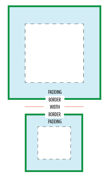
One of my least favorite parts about layout with CSS is the relationship of width and padding. You're busy defining widths to match your grid or general column proportions, then down the line you start to add in text, which necessitates defining padding for those boxes. And 'lo and behold, you now are subtracting pixels from your original width so the box doesn't expand.
Ugh. If I say the width is 200px, gosh darn it, it's gonna be a 200px wide box even if I have 20px of padding. So as you know, this is NOT how the box model has worked for the past ten years. Wikipedia has a great history of this box model. Jeff Kaufman also dove into the history
Anyway, I have a recommendation for your CSS going forward:
/* apply a natural box layout model to all elements */ * { -moz-box-sizing: border-box; -webkit-box-sizing: border-box; box-sizing: border-box; }
This gives you the box model you want. Applies it to all elements. Turns out many browsers already use border-box for a lot of form elements (which is why inputs and textareas look diff at width:100%;) But applying this to all elements is safe and wise.
Browser support
Due to browser support, this recommendation is only for projects that support IE8 and up. (Full browser compat at MDN) Firefox still needs the -moz- prefix, and <= iOS4, Android <= 2.3 need the -webkit-, but everyone else uses the unprefixed. You can find more info about a box-sizing polyfill for IE6 & 7 at html5please.us/#box-sizing (which was developed with * { box-sizing: border-box!).
Is it safe to use?
Totally. jQuery works pretty great with it (except this). As mentioned, browser support is excellent. And a number of projects use this layout model by default, including the WebKit Web Inspector (aka Chrome DevTools). I heard from Dutch front-end developer Yathura Thorn on his experience:
We've been using
*{box-sizing: border-box;}in one of my projects (deployed in production, averaging over 1mln visits a month) at work for about a year now, and it seems to be holding up just fine. The project has been tested in IE8 & 9 and the latests Firefox and Chrome versions and we've had no problems. All jQuery (+UI) offset calculations and animations run fine, even in any element we've displayed as inline-block. As of late we've started testing the project on mobile devices (iPhone, iPad and Android) and we've had no issues regarding box-sizing with any of them yet, so it seems to work just fine.
One of my favorite use-cases that border-box solves well is columns. I might want to divide up my grid with 50% or 20% columns, but want to add padding via px or em. Without CSS's upcoming calc() this is impossible... unless you use border-box. So easy. :) Another good one is applying 100% width and then wanting to add a padding to that element.
Performance
Lastly on @miketaylr's inquiry, I also tested perf overhead. Anecdotal evidence suggests border-box isn't significant.
You might get up in arms about the universal * selector. Apparently you've heard its slow. Firstly, it's not. It is as fast as h1 as a selector. It can be slow when you specifically use it like .foo > *, so don't do that. Aside from that, you are not allowed to care about the performance of * unless you concatenate all your javascript, have it at the bottom, minify your css and js, gzip all your assets, and losslessly compress all your images. If you aren't getting 90+ Page Speed scores, it's way too early to be thinking about selector optimization. See also: CSS Selector Performance has changed! (For the better) by Nicole Sullivan.
So... enjoy and hope you'll find this a far more natural layout model.
2012.02.03: Included webkit prefixed property and usecase of a 100% width box.
2012.02.22: Added link to Jeff Kaufman's history page.
Just curious if you've done any performance testing? I know Opera has a CSS profiler, but I haven't fired it up yet.
So happy to hear this being advocated by a premiere developer. I've been complaining about CSS's box model since making the switch from table-based design back in the late 90s. Ending up having to set your 600px-wide column to 587px or whatnot to account for borders and padding is highly annoying and can make going back through the CSS time-consuming. I'm definitely looking forward to using the new box-sizing options on my future projects that don't need to be backward compatible with legacy browsers.
On Quirksmode.org, it says this: "No browser supports box-sizing in combination with min- or max- width or height."
This statement is baffling and I haven't ever really tested it. It doesn't intuitively make sense why min- or max- width would be prohibited, but do you know anything about this, Paul?
Nice article Paul, definitely a feature I will begin to implement in my projects. It may be hard trying to learn a correct box-model though…
true this has been around a while, but I've always avoided it in production due to the apparent dearth of test cases in the wild.
Interesting idea as old browsers die… and to think we made IE fix their box model. Maybe we should have lobbied the W3C to change their box model instead. I hear this frustration from devs all the time.
If we could use conditional comments on a doctype, we could let old IE use doctype switching and render the old box model in quirks and use border-box for newer browsers. But that would put everybody into quirks (if I recall correctly)…
If you put a comment or anything above the DTD then it'll throw IE6 into quirksmode, which will make things work in IE6 as well.
As a side note, I'm pretty sure you need to add the -webkit- prefix for iOS.
@Thierry Not just in IE6 — comments before the DOCTYPE trigger quirks mode in IE7, IE8 and IE9 as well.
Unfortunately quirks mode may have other side effects. Here’s a list of things that work differently when quirks mode is triggered in Gecko. Are you sure none of these (other than the different box model) apply to IE?
I was just popping by to say what Thierry just did. According to http://caniuse.com/css3-boxsizing you still need the -webkit- prefix for iOS. I don't think it'd be a bad idea for older Safari as well.
@Mathias In all IE? I didn't recall that. Is the xml prolog an exception or does it trigger QM across the board too? Regarding differences, there are plenty, but the suggestion worth it if we're only "fixing" IE6 as it would be better to deal with QM issues in that browser rather than having a totally broken layout (imho). One of the many issue I recall is that IE in QM will obey this rule:
element {font:20px;}
instead of ignoring it because of the lack of font-family
Pleasantly surprised that you support this idea.
Never dare to use box-sizing like that. I have so the habit of recalculate widths without paddings.
But why not try on a next project!
I'm a big fan of this technique and have been using it in a number of mobile web apps (and increasingly) website projects. Its a really welcome way to create a sensible baseline to work from for cross platform development.
Time to find out which iOS still uses prefixed. I imagine it's pre iOS 5, but we can verify…
I'm also a fan of changing box-sizing—to an extent. I think it's only appropriate with fluid applications since percentage widths generate unpredictable sizes.
Changing all elements would only be repeating your objection to the box model in reverse. Now you have to account for the math on the _inside_ of the element. This is in many ways harder to keep track of because there's no longer a value in your stylesheet that displays the width. Want an image that's the same size as the content width of the wrapper? Now you have to subtract the padding/margins/borders from the width—instead of just using the width.
This seems like a buggy and highly unconventional solution to a simple problem. Instead, put your width on a container elements and padding on child elements. You'll find it works perfectly in all cases and you won't have to explain yourself at length to other developers on the project.
Webkit changeset 71348 (thanks peter beverloo!) removed the prefix.. It happened 15 months ago and dropped into Webkit Version 534.12. This means it's in iOS5, but iOS4 still uses the prefixed one.
For anyone using SASS, I wrote a SASS/Compass border-box polyfill that takes your values and outputs equivalent CSS for IE6 & 7. Take a look if you're looking for a non-JavaScript alternative.
https://github.com/doctyper/compass-borderbox
Or just use margins on the inner elements instead of using padding on the container. Allows for more flexibility too. I rarely use padding, only if I need to reserve space for icons and such.
box-sizing: border-box is the bee's knees.
@Derek Watson
Sometimes there's no way to add a child element to apply padding to that isn't otherwise completely unnecessary. What's the bigger evil, playing the CSS gods with new but fairly well supported box model adjustments or unnecessary markup?
I say the latter. By a long shot.
@Derek – I disagree that it's buggy or highly unconventional. Box-sizing as a property has been around for a long time, and is stable enough that it's now (mostly) non-prefixed. And look, a LOT of us have hated the W3C box model from day 1 and found it completely unintuitive. I've been waiting for IE7 numbers to drop enough to start using it. So it's a completely conventional and legit solution. It makes CSS easier to work with. And with the behavior polyfill, maybe now's the time.
Yeah, I incorrectly had the caniuse value for iOS Safari 5 requiring the prefix, but fixed it now. :)
I ran into an issue yesterday on iPad1 related to box-sizing, hence why I knew about the prefix issue. I learned the hard way… as usual ;)
Regarding what we used to call the "broken box model", I think the issue is that you do not own the content box and any change in border or padding impacts that content area. I understand that it can be easier for people to style boxes that way, but it's not a magic wand, you end up dealing with different issues.
For example, if you style a nested container using something like "width:50%" does it makes sense to you that what you get is *not* 50% of the width of the parent box?
box-sizing: border-box; can help with a lot of odd issues you run into when working on fluid/flexible layouts. @Richard Herrera – I'm interested to check out your SASS polyfill for IE7/6. My worry in using it has been on older mobile devices that don't support it, though I admit, there are probably other more pressing issues on older mobiles. For the time being, I've been using border-box on a few responsive sites with good results.
Hey Paul, thanks for the tip. I've been struggling with this lately and didn't know just how compatible this is.
:D
Nice. I'd ask you to add it to the HTML5 BP, but if it doesn't work for IE7 and below, we can wait.
If you add padding to the child elements, the layout won't get all wonky (assuming you're floating divs). Haven't played with box-sizing stuff but it looks intriguing.
Hey Paul,
Looking at the head of paulirish.com you have
No moz in there. Should it be?
Does using an * in the CSS replace this?
I've been developing sites with box-sizing set to border-box for a couple of years now, and I love it. I include it in the reset of our base project template, github.com/stephband/template.
The principal problem to watch out for is using it in conjunction with min-/max-width and min-/max-height. Generally, in webkit it behaves as expected, but some other browsers still treat these properties as content-box properties, amongst other weirdness. See, for example, FF has problems with min/max-height:
https://bugzilla.mozilla.org/show_bug.cgi?id=308801
These are minor issues if you're aware of them. The other problem is IE7 support, but I have a tendency to hack IE7 with it's own stylesheet towards the end of a project, and I don't have any qualms about fixing sizes for an otherwise flexible website for that browser.
Thank you Paul Irish. I'd like to know how does one turn box-sizing: border-box; off? As you may know, doing percentage math for responsive with list elements and padding gets mind-numbing. What I found, working from mobile on up, is that I was unable to turn it off and go back. I had to contain the box-sizing: border-box; declaration into an @query with a min/max declaration. How does one un-border-box?
@cwebba1
@thierrykoblentz And then there's the issue where images behave as blocks, rather than as inline-blocks. I played with the idea of triggering Quirks Mode when I started using border-box a couple of years ago, and quickly dismissed it because of the other rendering issues it introduces, and because of changes to the JavaScript DOM.
@stephband "Images behave as block"? I don't recall that at all. That would be true for IE5 too then and I don't recall that either… Are you 100% sure? And under what condition did that happen? I cannot believe QM alone triggers that.
Some Firefox bugs on border-box that @marcoos pointed out:
https://bugzilla.mozilla.org/show_bug.cgi?id=308801
https://bugzilla.mozilla.org/show_bug.cgi?id=338554
https://bugzilla.mozilla.org/show_bug.cgi?id=593964
Great, gonna use this on future projects.
And, +1 for "If aren't getting 90+ Page Speed scores, its way too early to be thinking about selector optimization"
@thierrykoblentz Yeah, no baseline space underneath them. It's a couple of years since I tested so not 100% – but it's documented here: http://www.quirksmode.org/css/quirksmode.html
Apart from box-sizing, for quick prototyping I sometimes also add * { position: relative; }.
@cwebba1 You can "go back" to the default W3C box model by overriding the * rule with "box-sizing: content-box"
sorry, can't help this but could you, please, add a bit more space at the bottom to play with or may be include a reset button?
thanks!
None can argument, that using the right parameter for right selector, like `.compact-box { box-sizing: border-box; }`, would perform the best result. Avoiding universal selector will just have improve your CSS.
IE7 has buggy CSS universal selector support http://reference.sitepoint.com/css/universalselector#compatibilitysection , but even so it has no native CSS parameter `box-sizing` support.
This made my week! I've been itching to go scorched-earth on the old box model and your endorsement of
is all the convincing I need to never look back. Let's move that web forward!
How haven't I heard of this! This is great! sass has been handy in the past for me to overcome the issue. I've always thought it was the stupidest thing ever, and +1 on using it for padding + % widths! Plans to incorporate into Boilerplate at all? I think it might be going into mine.
The lack of layout features in CSS 2 is the problem, not the box model. When CSS 3 Template Layout, Flexible Box Layout, Multi-column Layout or Grid Layout modules are widely supported this won't be an issue. I don't think switching box models in the interim is a good idea though. Learning a new behaviour can be time consuming and frustrating. I would use border-box for specific elements when needed instead. IE is the hold up again… Maybe an IE boycott/blackout should be organized. It was done for SOPA, why not for IE ;) It wouldn't be total blackout. Only a blackout if you're using IE.
Great article. I shed a little tear every time I read such an article as in my company we still have to support IE6. I would love if we could wipe peoples memory of IE6 using a normalizer, MIB style. It would make developers life far easier. Hoohum….
@Thierry Koblentz
Yepp, had do do this. Tested in iOS 4.1.
Cheers Paul !!!
This is easy and clear. I'm going to apply this on future projects :)
Well done
thanks
@Thierry Koblentz
Thank you. That's was another very important negative implication I forgot to mention.
I've always said that the box model was jacked. In the real world, a box doesn't get BIGGER if you put something inside it.
I think, box-sizing is one of the overrated features of CSS3. I never use and I (probably) never will use it!
Hey! This website gets a 56 on page speed! lol Joking aside, at the end, when you said "…minify your css and js, gzip all your assets, and losslessly compress all your images" did you mean "lossily"? You know, the good ole jpg action?
Funny, a few years back, this was one of the things I recommended to Sencha for ExtJS4. Since they had some of their own layout stuff going on, they had the typical "redundant layout" problem going on — they would size some things and then get sizes recursively. I convinced them to change a few things, this being one of them (you can look up the SenchaCon conference materials from 2010). It eliminated having to ask the browser for the real width of things.
PS: You didn't mention the backstory of how IE always did things this way and the W3C changed it to make IE not standards compliant. A long time ago, I guess. Sorta spiteful, but we are only human!
What about performance for IE<8 with the behaviour attached? Is it really bad?
I've also written simple Javascript (instead of the htc behaviour) as polyfill for old IE
https://github.com/albertogasparin/borderBoxModel
Not a direct link to this post: the color you use for the text make it really hard to read for someone like me whose eyes are not so good. The size of the typo is also very small and I must ctrl + several times. (:-((
I asked Ricardo, who wrote the polyfill, and he had good things to say about its performance. So, I'd just recommend you to test it out. :)
@Jacob Rask, setting everything to position:relative will also happen to very nicely crash IE6, which may or may not be a bad thing. :)
The Android browser, at least in Gingerbread, requires -webkit-box-sizing for this to work too.
"Not just in IE6 — comments before the DOCTYPE trigger quirks mode in IE7, IE8 and IE9 as well."
@Mathias But you can use X-UA-Compatible to force IE8 or later standard mode even without a DOCTYPE.
Oh, you think you're a smart guy, huh? Well, what do you do with this:
http://jsbin.com/odebug/2/edit#html,live
:)
(Even the random JSBin-generated URL calls it a "bug"!)
In all seriousness, I'm almost prone to think that this is why the "wrong" box model was preferred by browsers all these years.
@Yuhong Bao: Have you actually tried and verified that it works with IE8? My experiences with IE8, Conditional Comments around "head" and X-UA-Compatible suggest another behavior, but it may work with a comment before the DOCTYPE declaration …
i've always just 'double-wrapped' my divs — it's tedious but bulletproof:
verso rectoi've always just 'double-wrapped' my divs — it's tedious but bulletproof:
verso recto(sorry — comments #fail )
i've always just 'double-wrapped' my divs — it's tedious but bulletproof:
[div] [div style="width:50%"][div style="padding:10px"] verso [/div][/div] [div style="width:50%"][div style="padding:10px"] recto [/div][/div] [/div]This does break some third-party widgets like Disqus, since they add styles that assume the default box model. Of course we can solve that by using greater selectivity to bring back
box-sizing: content-boxwithin specific contexts — not ideal for maintainability, but then neither is the default box model. :)@jdbartlett
You would be far better just doing
.OldBoxModel{
box-sizing: content-box;
}
And adding that class to the containers. Much easier to maintain.
A new day, a new lesson. Thanks Paul for the this article and for the http://html5please.us/#box-sizing I din't know this site.
@Louis
Don't know what you are talking about.
See: http://jsbin.com/odebug/4/edit#html,live
The problem is you set height. Change it to min-height, or remove it (also add some padding to the bottom).
Box-sizing saves us I am tired of using calculator while styling :) Thx paul !!
@Mike
True, and with a height like that, it's not an extremely realistic situation. Maybe this will illustrate better what I was trying to show:
http://jsbin.com/odebug/5/edit
No height, but with unusually high padding values, again causing the inner element to break out of its container. And again, not realistic, but just illustrating what almost feels like a weakness in that type of box model.
I'm not saying this is a real problem, I'm just wondering if maybe this is why the standard box model was preferred. For practicality, the border-box method is best, but theoretically, the standard method works better in any situation.
Well if you're building an application you would want to constraint your content to a predetermined layout down to the pixel, chances are you also use 12px font and 10px font.
If it is a content based, you would want your content to determined the layout and use large font so it is easier to read.
Im looking to fix all known bugs with border-box in jquery in version 1.8. I've been saying for a while that all signs point to wide adoption of border-box, especially on mobile. If anyone here is using border-box and jquery and finds a bug please file it at: http://bugs.jquery.com Thanks!
This post has just made my life so much easier, works a treat with dealing with inputs and textareas, which otherwise are quite a hassle. I'm bookmarking your blog!
Like your post.. LOVE your background!
Thanks Paul!
I'm new to CSS and was getting frustrated with the common box model – it just didn't make sense to me. This will simplify my life!
You can't expect people to take this seriously when saying border-box usage is safe and wise, followed up by it not being supported below IE8. The majority just doesn't have the luxery to drop that browser range for years to come.
great tip, but non-square images with border / padding / margin appear to lose aspect ratio. presumably the same will happen to video too.
would this be a sensible tweak?
*:not(img,video) { }
I took this post to heart, it resonates as a simple way to make life easier
So, did anyone test PPK's remark about this?
"box-sizing does not work in combination with min- or max-width or -height."
- http://www.quirksmode.org/css/box.html
Putting this to the test 'in the wild' next week.
Have been testing out on an 'adaptive' layout last couple of days on:
desktop, iphone, ipad, small android.
So far so cool!
of interested > http://www.booniesfootwear.co.nz
@Alistair Scarlett
oops – http://booniesfootwear.com
The development of technology. We did not catch it.
Brilliant Paul. I've been frustrated with this since the start. Can't wait to try it out!
Just linking up Chris Coyier's great post on his experience with this and applying * to other properties:
http://css-tricks.com/things-it-might-be-funuseful-to-try-the-universal-selector-on/
@Louis Comment out "height: 200px;" and it's fine.
Interesting that Internet Explorer got this one right on the first try.
Cool article, but I think it could use more live demos!
You know what else works in IE8+ and all other modern browsers?
document.querySelectorShave a few kilobytes off your JS includes by dropping the selector engine out of jQuery- huge win if your target browsers are in this sweet spot.
Oh thank god, finally! No more container divs with padding!
Awesomeness! Will experiment with use with min/max-width in different browser. Thanks!
For those using Compass/SASS:
@import "compass/css3/box-sizing"
* { @include box-sizing(border-box); }
@David Graham, did you miss the part about the fallback for IE6/IE7? You CAN use this today.
Not only is this a good prospect for seasoned developers, but it removes a complexity that stumps many a new comer.
"I might want to divide up my grid with 50% or 20% columns, but want to add padding via px or em."
This is why I never end up using percentages for widths, even when they make SO much sense. Every time I try to use a percentage, padding mucks it up and I have to move to pixels.
Time to try it again. Thanks!
So the Internet Explorer box-model bug [1] was not a bug but a feature? :)
[1] http://en.wikipedia.org/wiki/Internet_Explorer_box_model_bug
@Dan Linn
The author writes that you don't need to worry about universal * selector performance, but if you're in an environment where IE6 is still used then you should worry. In pages with large tables (lots of DOM nodes), the * selector can slow things quite a bit. As I remember it may have been a factor of 10 difference in some cases. Thankfully I don't have to worry about IE6 in my current job — hopefully you can say the same.
I see a little issue with changing the box-sizing property though. If you're designing a site that will support plugins or external widgets, it may break their appearance as they may not have been intended to have such property.
I suppose this could be fixed by strictly determining where will external markup go, but still…
Haha, your note on performance made me giggle :)
In both ExtJS 4+ and Sencha Touch 2+ we have been using box-sizing: border-box. It greatly simplifies your CSS, layouts and many of the calculations we had to do in JavaScript before. Glad to see others are starting to see the benefits of this.
Thank you for this article! I had never thought about about it in the way that you discussed that if a box has a specified width, that the width shouldn't change just because we add padding. It's very true!
I will definitely be using this technique in the future.
I've been wanting to use border-box for a few years now and have only used it in 1 or 2 projects where IE6&7 support wasn't an issue. I just can't wait to finally drop support for IE7!
@Justin
Thumb up, I was just having this thought now :D
When defining widths in percentages, in general it makes sense to define paddings in percentages as well. But using the border-box model is a great solution for borders which sadly cannot be defined in percentages.
There's currently a bug with Chrom(ium) when using box-sizing and display: table.
http://code.google.com/p/chromium/issues/detail?id=103543
Having used this on a project recently, I'm not 100% sold on the idea. It makes perfect sense for things like grid systems, and kills a lot of the usual layout headaches – particularly when it comes to mixing percentage and fixed unit width/height values, but it can become annoying to have to declare
box-sizing: content-box;every time you want to override the universal selector.For me, it's best left on a per-use basis. But I can see it's use. Chris Coyier has some other great universal selector suggestions.
Turns out, jQuery UI actually does not play well with box-sizing: border-box;. Other than that, it works like a charm
This is great! I have two design projects just underway and I'm going to put this into practice immediately.
I 100% agree with using border-box sizing by default! However I just wanted to point out what is apparently a small issue with the current version of jQuery (1.7.1):
When you have border-box sizing and perform a size-changing animation, jQuery changes the element's overflow mode to "hidden" but does not change it back after the animation completes. I added this as a comment on the ticket http://bugs.jquery.com/ticket/10335 with snippets of the code causing this issue.
Paul,
Have you found issues with em units or troubles nesting border-box sized elements as Roger Johansson reports at the end of this article:
http://www.456bereastreet.com/archive/201104/controlling_width_with_css3_box-sizing/
Anybody else have experience with border-box in the wild?
This has been my pet hate for years. Well this and all versions of Internet Explorer.
As far as I can see, the polyfill for IE7 doesn't get applied when running IE9 in IE7 mode.
Update: Schepp already fixed the box-sizing polyfill IE9 in IE7 mode issue ( https://github.com/Schepp/box-sizing-polyfill/issues/5 ), re-download and get your IE9 to simulate the correct stuff when testing :)
I think I might be going crazy, but I think Chrome and Safari treat line-heights differently with border-box than does Firefox. With Chrome/Safari it seems the border gets counted against the line-height, but in Firefox and IE it does not. Has anyone else experienced this?
Why…why…didn't you tell me this trick earlier, when I was having a headache with 100% width…
We had to remove this from * in our CSS framework. In Webkit browsers, this can create a bug with columns, where a column can float to the next row, to never float back up to its original position. We've seen this in several different instances. We're now targeting specific elements that actually need the border-box. It is a little scary using the * selector anyway. It's a great property, but I'm not sure * is a good idea.
Very useful practice to integrate into my workflow! Thankfully the website I develop for only supports back to IE8 due to traffic stats, so this will work great for us moving forward.
Cheers!
@Louis
What that example illustrates is bits of text breaking out of their containers horizontally, because the width of the container is less than a single word length. This happens in either box model. Set some type in 200px size inside a 50px wide div of any box-sizing type and watch what happens. It doesn't point to any failure of border-box sizing
@stephband no baseline below images does NOT mean images behave like block in quirks mode, because they don't. The PPK page you link to refers to the baseline in quirks and standard mode, nothing else. They *do* behave like inline replaced elements, not as block elements like you suggest in your comment.
Well I guess I'm facing a little problem with this and I want to share with you guys. I'm developing a huge e-commerce and after almost 4k lines of css code I decided to try this "trick". After three days and already convinced about its sucess I accidentaly saw this issue http://dabblet.com/gist/2650333 Would you tell me whats going on? Thanks in advance!
@Edson – With "border-box", the effective height of your div's content is .5em (height minus padding-top/bottom). If you want to fix it, height has to be 2.5em. This is the same effect with the width but we don't see any problem because the text makes a new line at the end of the div. (hope you understand, i'm french ;)
@Tiery Thank you Tiery! I didn't realize that "border-box" also affect the height of an element. I appreciate your tip!
Chrome 19 breaks box-sizing: border-box when the following style is used: 'display: table; table-layout: fixed'
http://code.google.com/p/chromium/issues/detail?id=124816
Really Nice post and comments. More Informative
Thanks for the good article!