… or … On “the site must look the same across all browsers”
I think we’re all pretty well convinced that our sites can look different across browsers. Sometimes, though, our team or our clients don’t totally understand that.
Lemme take a stab at convincing them that each browser gets an experience that is customized to that browsers’s capabilities.
Paul Boag actually created a small booklet for your clients on why this is good. Take a look below and download the PDF to share.
Paul lays out these arguments for things looking and acting differently:
- More time for what matters
- Develop for your growth audience
- Improve site performance by letting the experience scale
- Better search engine rankings through faster sites
- Your work will be more future proof
- … and more maintainable
- Wider and more impressive design possibilities
- Users don’t open your site in two browsers
(Andy Clarke’s book Hardboiled Web Design also covers this ground well)
The TAFEE approach
Taking a TAFEE approach is critical if you expect to deliver worthwhile experiences to your clients while continuing to support the legacy browsers that tend to linger around. Lemme give this guy a definition:
TAFEE (pronounced: taffy): tiered, adaptive front-end experiences. Customizing the experience to the unique capabilities of each browser, prioritizing a fast and good UX over consistency.
It’s also worth bringing up a term I mentioned a bit ago:
Your alternative to a TAFEE approach, of course, is taking a ‘same’ approach, wherein things are visually and functionally consistent across all your target browsers. In my experience, this takes much more time to develop and QA—not to mention you’ve set the baseline experience very low.
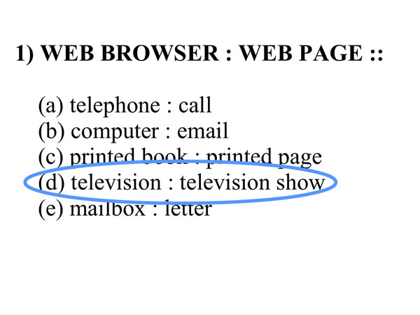
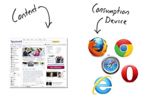
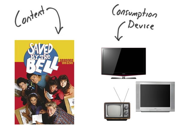
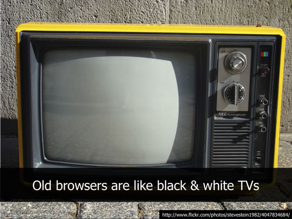
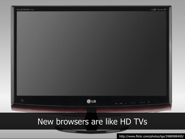
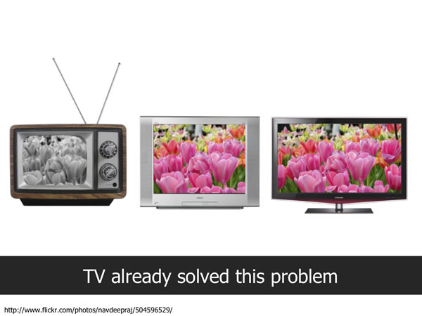
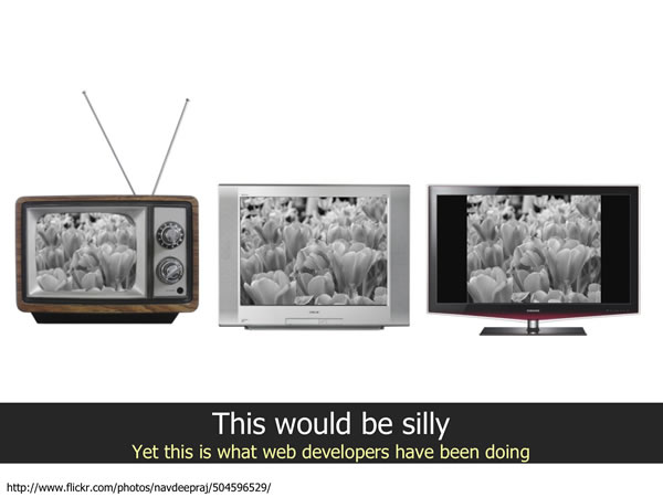
One of the best metaphors for scaling the frontend experience comes from Nicholas Zakas I’ll let his slides do the talking:
Zakas’s TAFEE vs ‘same’ TV analogy
speedy site > consistent site
Now, it’s worth pointing out that javascript runs at incredibly different speeds in the various iterations of Internet Explorer…
Given that, it’s up to you to guarantee a performant and responsive experience for ALL your users. That means making it easier for oldIE to chug on your pages, serving them a lighter weight experience, in order to keep it quick.
Why should you keep your site as fast as it can be? Read up on The Performance Business Pitch by Stoyan Stefanov who lays it out best. Suffice it to say that highly performant experiences are KEY to your site
None of your users open your site in multiple browsers, so if you’re actively trying to make things look the same for that false goal, then you’re slowing down the page for your users on older browsers. You’re loading them up with images that mimic border-radius and box-shadow, piling on scripts to maintain visual consistency when you should be focusing on making something that looks good enough and is fast. Louis Lazaris touched in this in The browser performance pickle where he identified that our goal of speed conflicts with our ability to polyfill nearly all features. (There are best practices for this, specifically… stay tuned as Divya Manian and I have something coming for this… ;)
delivering multiple versions
Consider what Google has done with the Google doodles: show off cool <canvas> or bouncing balls with just HTML+JS in “good” browsers and just keeping it the same old Google logo for slow browsers. You heard anybody complaining that they don’t get the bouncy balls in IE6?
Facebook, Google, Yahoo all embrace a TAFEE approach to show different browsers different things. It’d likely be wise for you to, as well.
It might make sense for you to segment your experiences into HD (high-def), SD (standard-def) and LR (low-res) tiers. Then you might move to clarify exactly which features are required for each to identify which features are required for your HD tier and so on. IE7 and IE8 may get the LR tier, and if you’ve punted supporting IE6 completely, I’d recommend prompting to install Chrome Frame. It’s what we’re now doing in HTML5 Boilerplate 2.0, in fact.
You have some choices to make in how you scale the front-end experience, and I hope you’ll have a better idea of how you’ll do it and how to communicate this plan to your team and client.
Thank you to Divya Manian, who helped me tremendously with crafting this. Also she just got a sweet interview on Mozilla Hacks.
