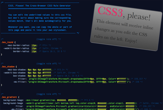
Introducing… CSS3Please.com
Man, whenever I'm writing some css3, I get so tired of writing all the vendor-specific prefixes (like -moz-border-radius). Combo that with remembering who supports what and I wantedneeded a shortcut.
Today, I'm happy to release v1.0 of css3please.com: a cross-browser css3 rule generator, produced by Jonathan Neal and myself. In addition to syncing and normalizing changes across the necessary properties, it also sneaks in IE support for a few features via IE filters. Right now it helps you write the rules for: border-radius, box-shadow, linear-gradients, rotation and @font-face. A few more transforms like skew and scale are on their way, stay tuned.
Shouts to all the good people doing research and making tools in the css3 arena: John Allsopp, Chris Coyier, Stoyan Stefanov, Damian Galarza, Ryan Seddon, border-radius.com.
Please leave comments and feedback below.
Based on the popularity of this tool, I'll definitely keep working on it; making it better for ya'll. If you would like to contribute, please contact me.
Chytac pa-belarusku (belorussian translation)

Great site but it makes my IE6 crash :(
@Fredrik Carlbom
Yeah the tool itself doesn't work so hot in IE6 and IE7 at the moment (tho the CSS it makes is peachy); it works a bit smoother in IE8 but not flawless yet.
Yay!
That's cool. Now use jQuery from Google's CDN, merge all plugins into one file, minify it and put all the script tags on the bottom of body tag ;)
Rock on, Paul. That's some extra-spicy hotness you've got there! Beautiful job. Will make my super-fancy styling much faster now.
Great work!
but where’s the theme-song? ;-)
@MyFreeWeb
Thanks. I just put in the concat and minfication and cdn.. they're gonna stay in the head only because the js syntax highlights the page and I want to minimize FOUC. <3
@Torsten
Good call!
This is CSS heaven sent! As long as it stays up to date, this is really going to make life easier. Also, love the (shift) up/down arrow keyboard shortcuts. One criticism would be the color choice; being able to have a white background would be great. :)
Awesome! Of course, I went ahead and tried to break it:
– Any support for ellipitcal border radius? Webkit Mozilla syntax differ.
– Howz about inset box-shadows? Mozilla & Opera both support these.
How about support for tabbing to the next property? Other than that I like it so far.
@David DeSandro
I think i'll let border-radius.com take the elliptical border radius market for now, but who knows.
good call on inset box shadow.
@Greta
definitely. i'll do that. :)
I wonted to build something similar with pure CSS, something like CSS3 framework. But I realized that make no sense building CSS framework for CSS3 effects because is not dynamic. But with little javascript(jQuery) you resolved this issue :). Great work!
wow, this is really gread – and inspiring!
One thing you could add is rgba background color. IE can fake it with the gradient filter.
Good job!
Cool! So would this become like CSS zen garden and you can customize a whole page? Or just the box?
Externally useful for cross-browser rapid css dev
That is really cool, but I agree about the colors. I can't read some of the blue text on the dark background at all, though I think part of that is the absolutely horrendous rendering of the font.
Nicely done! It's missing border-image though ;-) …
http://www.w3.org/TR/css3-background/#border-images
Awesome! Great concept and implementation! The design rocks too. I'll spread the word.
My god. This is awesome.
It doesn't work if you use RGBA for the colors. :-)
@Dominik H.
Thx for the heads up. We got a new engine brewing in the background that should address that.
Fantastic job guys. Especially impressed when, out of habit, I used the arrow keys to change the value… nice. Would like the option of a white background tho :-) Thanks again!
It would be great if you got a preview of the css like this site does for rounded corners: http://border-radius.com/
@Bobby Nevermind, I'm really dumb… It updates the logo, didn't notice that…
Will you be including any -khtml- rules?
Damn brilliant! It's like a million random CSS3 blog posts jammed into a single kick-arse tool – I can feel the CSS3 start flowing through my veins! I better see a doctor about that.
@Marcy
It's unlikely that I'll add in support for -khtml.. I can't find a compelling reason to do so.
@Mr Speaker
Thx mucho, mi amigo.
Great tool!
But it would be great if it would have a white background instead — its much easier on the eyes!
If you really don't want to do that, you could at least improve the comments contrast.
But all in all: Excellent work! Thank you!
Great idea, it would be great if it support rgba in instead of only hex (i know their is the rgba rule as well, but for things like boxshadow I use rgba.
Thanks
Great !! and we don't matter IE6, he's dead :)
Thanks very funny and interisting!
great.. thanks very interesting :)
That is one very excellent tool. I agree with an earlier comment about the comment colour making them difficult to read, but otherwise it's very very cool!
Amazing. Thanks so much for the interesting article. I've been intimidated by CSS3 for a while now and now I think I love it.
great tool!
thanks
I started working on something similar to this last weekend…
http://css3generator.com
Just didn't quite have time to finish everything I wanted. Hoping to add live preview, tips and example code soon.
I love your version tho. Great job!
Real nice !
Two suggestions:
1. Ability to save and send url with specific settings to someone
2. Ability to use several shadows, I'm not sure it's working, for ex.: -moz-box-shadow:0 15px #FFFFFF, 1px 5px 10px #777799;
Keep up the good work !
@Randy Jensen
Ah very nice. I think yours handles some cases where css3please will never succeed well. Happy to see it move forward. :)
@Warpdesign
Very nice. Good feature requests. I'll probably prioritize working with rgba as an arbitrary color everywhere, but I like these ideas a lot.
man, thats awesome!
thank you, and everybody involved in this project, very much, just what i needed.
great work guys!!!
This is indeed useful!
I miss IE6+ working version. Even if only toggling on/off would be great. I don't really care for the editing part to work there.
It is a tedious task to copy the styles and test by hand. But it's nice to have this as a reference! =)
When entering a shorthand hex value, such as #000 for black, it replaces it with #0000 causing NaNs in rgba()
Just a heads up!
Nice work! Looking forward to the updates :-)
Simply Superb! I m loving it!
Love this page. Doesn't fill stuff in like I imagined from the teaser text at top. But I've used this a bunch of times since Friday. Thanks!
great interface
In Firefox and Webkit, the RGB value in box_rgba is always applied and the RGBA value isn't, so no transparency is visible. (It works in Opera) There's also an error in the formula that converts between them (comment #40).
Rotating the box makes it lose position:fixed in Webkit, is that a Webkit bug?
This is excellent, although where were you a week ago Mr Irish!?! I'll use this in my next project instead :)
I don't see all property in IE8
gradient and rgba are OK
.box_shadow just make a text-shadow effect
.box_rotate just make the text look better (antialiasing)
and offcourse there is no rounded corners
Did i need something more than the browser itself ?
For information my version of IE8 : 8.0.6001.18702
Awesome work! Thanks for making it publicly available!
Gradient doesn't seem to work in FF 3.5.2. :(
Great tool Paul, keep it growing.
Maybe the
text-shadowcould be implemented there also?
@Rico
IE8 isnt supported all the time, but rotation should be okay. I'll see if i can replicate.
@Mark
FF3.5 doesnt have gradient support. only 3.6 does.
@JD Gomez
text-shadow aint bad at all. I already have the syntax for it. it'll go in. thx. :)
Wonderful, useful resource for me! Thank you!!!
That's a really great resource. Four things, though:
(1) You've listed box-shadow as a supported property in IE9. Is this accurate? I haven't seen this confirmed anywhere.
(2) IE has supported @font-face with EOT since IE4+, not IE6+.
(3) How about a really simple section for the opacity property?
(4) Shouldn't you specify trutype fonts as working in FF3.5+?
Loving it, nice way to display it.
keep up the good work.
Thanks for the shout out Paul.
Nice work and love the little things you've done, mouse scroll to increase/decrease the values is a nice touch.
Fantastic idea, love it…
The displayed block on the right doesn't seem to work all that well in IE8, but the rules are all correct and that's what matters.
I'm sure I'll be using this on my next project. Thanks!
A tweak to .box_shadow (based on your default values), as I think Microsoft's Shadow filter is the one you want (since Dropshadow results in a solid block of color). Try:
These also function as a rough equivalent to
text-shadowfor all child elements if the filtered element has no defined (solid)background-color.@Erik Vorhes
Thanks Eric. Dropshadow snuck in there even though I've been using Shadow as well.. I'll definitely change that up, as the current DropShadow is crap. :)
Thx
Excellent
The firefox gradient values are backwards. The gradients run the opposite direction from shown on Firefox.
Was just about to write that the firefox gradient values are reversed, which Ted also wrote, but you can also just switch the "top" direction to "bottom".
-mpm
Fantastic tool! Any plans to add text-shadow as an example?
-dti
@Jason Chandler
Yes! soon.
Awesome! Thanks for posting this!
This a fun and an intuitive way of learning CSS 3.0. I thank you for doing such a wonderful work.
Don't work on Opera 10.10
Fantastic tool.
Though the rgba control needs looking at in Chrome.
It applies NAN values too easily.
It may be better to use 00 when NAN would be the result.
Also IE drop-shadow filter usually looks rubbish, but a better effect can be obtained using the glow filter instead.
Useful piece guys.
@mike foskett
Thanks Mike. We'll be landing a bunch of improvements soon that should tackle those issues.
OMGWTF I love you.
please tell me you aren't already a father cause I would like to bear your children.
Thank you.
I was having issues with the transparency solution you had for IE8. For some reason it would always come up as a solid color, even though it'd be transparent in ie7.
This is what I ended up using to get it to work in ie8:
this actually rules – thanks guys!
The solution you've shown for rotation in IE leaves much to be desired.
1) BasicImage can only rotate in 90deg increments. So you're provided example of 7.5deg doesn't do anything at all in IE.
2) The Matrix filter offers a much more robust rotation framework.
2a) The calculations from degrees to a matrix are ugly.
2b) The transform-origin in IE is defaulted at something other than 50% 50% like moz and webkit.
2c) IE lets you set the transform-origin (Dx and Dy) but that means it won't properly re-size the bounding box. It's either/or.
2d) IE transforms without including padding and border which further confuses the transform-origin.
It's not exactly possible to do a direct cross-browser rotation. Here's a complicated article that someone should re-write into English.
http://someguynameddylan.com/lab/transform-origin-in-internet-explorer.php
@Grady
Thx very much for the comment. My buddy Zoltan did some kickass work with rotation that I hope to integrate into this soonly:
http://www.useragentman.com/blog/2010/03/09/cross-browser-css-transforms-even-in-ie/
Thx for dropping the knowledge and for the link. We'll upgrade this badboy.
Great job on this tool, Paul. What kind of traffic have you been getting on that page? I imagine quite a bit, as it's been tweeted and shared quite a bit in the community.
FYI – About a month before you released your tool I had put up a CSS3 "click chart":
http://www.impressivewebs.com/css3-click-chart/
But yours is so much more useful! Thanks again.
The problem with the box-shadow equivalent in IE using their own proprietary filter is that the shadow itself is counted to the total width of the element. So if you have a 'strength=7' value on all sides of the box it will consume 14px vertically and horizontally.
Anyone who managed to solve this? I think it can be done using positioning but I doubt it's practical.
can this be used to create pure css-tabs ? (without worrying about flaring out the bottoms of the tabs, which would be even cooler) I could use color & font changes to handle the current tab.
Nice. Good work! Does it mean the end of photoshop? ;)
Yay! Wicked!
Brilliant. Huge thanks for writing this and making it available.
Cool. It'll help a lot to get to grips with the new stuff in CSS3.
Congratulations.
Hi Paul, really great and clean solution! And thank you for playing area at the bottom of this page! ;-) Relaxing!
Nice work. It's nice to find people like you on the net. Thanks, keep up the great work.
Hi Guys, I'm excited about the possibility but I'm looking at http://css3please.com/ in IE6-8 and don't see the shadow working. The gradient will work if I toggle the shadow style. I couldn't get rotate to work. Am I missing something? Nice work so far.
FYI, The gradient rules for IE don't work. They use
and
. These should actually be
and
(CamelCase). See MSDN documentation.
Thanks for all the work. It's a mighty handy tool!
Great site.
Why hasn't microsoft introduced this CSS3 feature yet?
Gradient for WebKit seems to be reverse of other gradients (i.e. bottom to top instead of top to bottom)
Hi there,
Nothing about column-count, column-gap and that kind of stuff?
We miss them!
=)
I just pushed a big update.
Mousewheel support is much better and the clipboard interaction sucks a lot less.
We now have 360° IE rotation support thanks to Zoltan and css transitions. (Along with a buncha small fixes like the gradient thing)
@STPo I'm personally not crazy about columns so you'll have to hit up http://www.css3generator.com for that.
@Gordon Brander Fixed!
@allen joslin Nah this isn't gonna help with pure css tabs.
@Grady You should dig the brand new rotation logic.
Thanks all for your comments and feedback.
I would love to see the ability to switch between top-to-bottom and left-to-right gradients. IE can do this according to http://www.scriptfx.com/transitions/gradient/gradient_filter.htm
thanks for sharing !!!
Thanks for sharing ! Great ressource I always keep around when I'm coding…
I was just wondering how can you calculate the degrees for the ie box rotation ?
Very cool! It would be nice to get rounded corner settings for each individual corner for when authoring tabs (i.e. only 2 corners rounded) since these settings are also not consistent across browsers.
@STPo
Anothe good explanation of why multicolumn css layout is troublesome..
@Jµ
We're using math that's described in this post:
http://www.useragentman.com/blog/2010/03/09/cross-browser-css-transforms-even-in-ie/
@Randy
Definitely. We'll add the ability to switch from basic mode into TRBL mode. :)
Also btw.
I maintain a beta version of this at css3plz.com if anyone wants to spy on upcoming features.
Box gradient wasn't supporting rgba values. Any idea why?
Hey Paul, great tool, thanks.
Can I suggest a tiny little fix? The rotate filter breaks subsequent css for IE6, but it seems to work if you reorder the matrix array, putting sizingMethod at the end of the M values, rather than before.
Thanks!
Brilliant work.
Thanks a lot for this useful tool.
Hi, the CSS3Please is great and useful, but as I use TextMate, i thought it would be even better if I could generate the snippets right in the editor (even loosing the ability to preview it). So I've packed the snippets into a simple bundle and here it is:
http://github.com/filipepina/CSS3-Please-TextMate-Bundle
I've made it two weeks ago and i think you have changed a few things regarding IE, I'll change that later!
Sorry, didn't check for all comments and feedback, just a quick feedback. If I use the filters for IE7 (corrected to be single line), the whole css get's fucked up.
Beside this… really handy site, I use it quite often, thanks..
For the missing CSS3 for IE like dropshadow, textshadow and border radius simply implement this .htc file in your CSS.
http://fetchak.com/ie-css3/
Your site is damn nice — many thanks!
It shows very clearly how CSS3 will make _my_ life easier.
In order to make the MS transparency filter work for IE8, you will have to set background:transparant before declaring. Remove the background-color declaration.
Great tool i love it thanks for the hard work
awsome! thans for your hard work.
Thanks!
Is it possible to add more color stops?
@Paul Irish
http://wiki.github.com/heygrady/transform/correcting-transform-origin-and-translate-in-ie
I've started on a jQuery plug-in that does the transformations cross-browser. I've managed to approximate support for transform-origin in IE using the sylvester.js library. It work's perfectly in my testing down to IE6. I've posted an article about how to make IE behave and have a standard transform-origin.
WOW! Great tool!
I like your tool and came here to say grats…but, wow! what an amazing effect on your background!!!
I simply gave up! Keep up the good Job!
-Shahab
How do you get box shadow not to stretch your page out? I have a div that stretches 100% of the page's width and when I add box shadow it stretches it the length of the shadow. Please Please help, I really do apprecieate it. And I LOVE your site, it's amazing.
Thanks for the great site! I would appreciate support for gradients with multiple stops.
Very nice job man! Keep going!
I just loooooved this :)
Just a heads up, at least on FF 3.6.3 when I set some values for the alpha channel in rgba() like 0.9 or 0.7, it returns NaN.
Also, the hack for this to work in IE8 doesn't really work on mine (Win7). This is what I used instead:
-ms-filter: "progid:DXImageTransform.Microsoft.Alpha(opacity=90)";
Hope this helps :)
Again, great work, man! Keep it up!
repeating the usual, awesome. Thank you very much.
and nice work on this site too, the mouse moment swirls. cool !!
Thanks for posting, a nice all-in-one CSS 3 reference for common task.
Thia is AWESOME! I took a break from web work for just a bit and suddenly I found I need to learn CSS3 (& HTML5) and I was shaking in my boots. I was a Queen in the CSS2's & XHTML, but was lost with CSS3 and different browser requirements. I thought I would have to give up, but you've made it make sense to me when no one else could. I can't thank you enough. I'm back to learning, but now need to know just how I can make my site fit a hand held, a netbook, a 1600 by x, etc. Thanks again for getting me back on the road the learning again; I loved it before and then got lost. Now I'm found. YaY!
You've made the web a better place. I am writing much better code now and am going back over code I've written and easily update my incomplete CSS by dropping my settings into your code and retrieving the cross browser results.
Will definitely subscribe to this page in my reader so I will be notified as soon as there are any updates. You have made me a better netizen.
Aside: Would love to know how you make it so I can Doodle in the margins.
@Michael O'Neal Found the answer to the Aside at http://paulirish.com/2010/my-harmonious-background-canvas/
I share Nancy´s opinion: Greatest Tool ever for intuitive code work! Thanks a lot, i adore it!
Interesting: I just tried to use the IE-Filters for a rotation-Property on my portfolio-Site alexweb.info. IE8 behaves like it should, but in IE7 all my other scripts (cufon an jquery) are destroyed, and the filters don´t work either. That´s not bad, for the effect must´t be seen in the IE´s – Progressive Enhancement. It´s just always testing on the web.
Interesting No. 2: The Rotation by IE-Filters ist not quite the same like with just CSS3: The latter rotates the object (an img-Tag in my case) around its middle point, whereas the IE-Filter takes the upper right corner of the object as the fixed point for the rotation. Did you realise this difference?
@Alex
1. very interesting. Yeah these IE filters implictly come with a YMMV tag on them. :)
2. Yes indeed. There's nothing I can do in the UI to accomodate for this (unless i ask for the actual height/width dimensions of what you're rotating..) but this wil have all the answers you need: http://wiki.github.com/heygrady/transform/correcting-transform-origin-and-translate-in-ie
All important CSS3 features on one page, thx for sharing that overview Paul!
Great site!
I was wondering if there is an equivalent for CSS2?
I couldn't get RGBA working with your syntax, but I got it working in IE 6, 7, and 8 using the following syntax:
And how about adding a text-shadow property for modern browsers and IE.
Hi,
i need to put some dropshadow to div- (and perhaps table-) elements.
The Defiitions from your generator work quite fine in Firefox, but i cant geht the shadow to work in IE8, even with the .htc-file mentioned in the comments or the
-ms-filter: "progid:DXImageTransform.Microsoft.Shadow(Strength=6, Direction=135, Color='#000000')"
Definition. The shadow does never appear in IE.
Is it necessary for the element which should get the shadow to have a fixend width ?
I'm sorry that i could not provide smaple code but i have to use this to "modernize" some extranet-website which was developed 10 years ago in IE-Only-Fashin and now should get some new layout, and cross-browser-support (finally some doctype, yay!)
As mentioned before the Filter does not show up and even this developer-Gadget in IE does not show it in the css-area.
I'm using windows 7 as OS, in case this is important…
any ideas?
Thanks in advance,
Ge0rgy
@Fredrik Carlbom
unless i'm mistaken, the tool itself makes no claim to run in IE6, but rather to generate cross-browser css. best to run the tool itself in a modern browser like FF or chrome or ie8. am i correct about that?
i DO hope the authors will sneak in more IE6 generated css!
There is no eot fonts on the @font face rule, So IE is ignoring it all!
The goal of most web designers is to get their design to work in IE so if you could make your rules more cross browser compliant it would be better.
@Jaycbrf4
I see the .eot in there… http://paulirish.com/i/f000.png
This has been very handy. Thanks!
What is the support for alpha gradients? You could do some nice stuff with alpha gradients..
This tool is awesome! You have really done your research on this. I know of no other tool that makes it so easy to create slick CSS3 snippets so easily. Can not wait to see what else you add to this tool.
I was just experimenting with the background gradient feature. I wanted to create a gradient with a transparency, and it turns out that it is easy to do by using rgba colors instead of HEX colors. This is awesome! I tried putting rgba colors into css3please, but rgba colors do not get interpretted correctly. When I put in rgb colors it converts these to HEX just fine, but obviously rgba colors cannot be converted since there is no transparency version of HEX (I wish!).
Anyway … would love to see support for rgba in a future version if it is not too much work.
@Michael Thorne
Hey Michael. Good call and I appreciate the push.
There are some javascript architectural reasons it's been hard to add rgba but I'm making it a priority.. Cuz I agree.. hex only goes so far.
Cheers.
Fantastic! Thank you or your great work!
Is there any way you will also be covering the box-sizing values, like the CSS3Generator?
.box_rgba {}
/* IE 8 comment isn't closed. Fix please!
Also thanks for a great css cheat-page!
hey, nice work!
but I've got a problem using gradient for the background of a page. I put the code from css3please.com and used it as background of the . this works fine as long as the viewport is bigger than the content, if i had to scroll the gradient is shown as patterns. only the beloved IE8 does it right.
Ideas someone?
Greetz
I love the css3please.com site and makes my life easier… just curious why you do not use the -o- extension for opera? Perhaps it should be added, or is it not necessary?
You are my new hero. CSS3please is… absurdly brilliant. And I thought rounded corners were the future.
ok, solved my problem: if you want to use gradient for site background add it to the <html> and use a
Great Work and Great site.
One caveat about using the IE gradient filter for rgba background color: the filter fails in IE7 when any degree of page zoom is applied (other than 100%). :(
The .box_rotate calculations alone will save me lots of work. Thank you, thank you.
Hey,
very nice site :)
btw, Chrome 6 supports box-shadow without the vendor prefix. Should be added to the comments in the box-shadow section, as it's one step out of the vendor prefix mess ;-)
Great resource, I find myself coming back here very often to grab code snippets to 'enhance' sites to people with better browsers! Thank you for time spent, awesome execution!
Hey Paul, just thought I would mention this: When I copy and pasted the .box_rotate styles at the top of my CSS, none of the CSS would load in IE6 and 7. I just moved it to the bottom of the CSS and everything worked fine. Have you run into this or should I explore further? Not a huge deal, just curious.
Thanks so much for your kick-ass hard work. Peace!
Hey Paul,
here's what I discovered on the weird css rotation thing:
IE6 and 7:
You must declare at least height or width on the div that's going to be be rotated BEFORE your rotation filters appear in the CSS. Even if you do this, however, any styles applied to that div AFTER the rotation filters appear in the code will not be applied. The same seems to be true for any styles applied to that div's children as well. Weird.
IE8:
This seems to not be a problem. I successfully applied styles to the div (including declaring its height or width for the first time) after the rotation filters appear in the code.
Obscure, sure, but it could definitely be a lot harder to hunt down in a huge stylesheet. Hope this helps!
Thanks a ton!
The tools is just amazing! I don't understand how I lived all these years without it. Thank you very much for the excellent job!
Peace!
This tool has been too useful for me! Thanks Paul :)
u indeed make www fun!! awesome :)keep it going!!
GREAAAAAAAAAAT TOOL! Keep it up! :)
Great tool!
The rgba color's "a" isn't working. Anything but 0.5 doesn't work (returns NaN).
Also, something I'd like to see is support for vertical and horizontal values for the border radius property (e.g. -webkit-border-bottom-left-radius: 5px 10px; )
Paul, more CSS rotation weirdness to report:
In IE6 and 7, even if you follow the rules I posted a few comments back, you will still totally break your site if you use more than one rotation filter per external CSS file. You either have to have separate CSS files per rotation filter, or simply add each filter nested in its own unique style tags in the head of your html. Failure to do so will only display the first rotated object, but even this will be blurry and at the incorrect angle.
Hilariously, removing the DOCTYPE causes all the rotation to render perfectly, so I'm assuming quirks mode knows how to handle multiple rotation filters? Also, with a larger, more complex stylesheet, there were even weirder side effects, but I couldn't pinpoint what was causing those. Anyways…
Take home message:
Use only 1 proprietary ms filter: (when used for rotation, at least) per external stylesheet.
and..
Each rotation filter in your html must be in its own set of style tags.
Hope this helps! Thanks a million!
Thanks for excellent site, css3please.com. i recently discovered you forgot to mention vertical and horizontal gradients for ie:
GradientType=0 : vertical gradient
GradientType=1 : horizontal gradient
filter: progid:DXImageTransform.Microsoft.gradient(startColorStr='#001d77', EndColorStr='#3db7e4', GradientType=1 ); /* IE6,IE7 */
-ms-filter: "progid:DXImageTransform.Microsoft.gradient(startColorStr='#001d77', EndColorStr='#3db7e4', GradientType=1 )"; /* IE8 */
Would love to add multiple backgrounds as well, same as there:
http://www.impressivewebs.com/css3-click-chart/
Thanks for the great tool!
Hey!
Nice site!
Only issue I see right now is the ability to use RGBA inside of other elements like… box-shadow :-\ It's my only extra step I have to do after using it.
Thanks for this!
hey
thanks for this great site, anyway, there is a method to make opera read gradients:
+ the svg:
Thank you very much. Very cool tool. Nice work. :)
Transparency, Please! ;)
Thanks, I played with your page and found it very convenient, especially the IE specific parts!
A few comments:
- rotation didn't work for me in IE 7 (try -90 degrees)
- will this be compatible with IE 9?
- any way to have the URL reflect the choices? Once I have selected my settings in a browser, I'd like to quickly look at the result in other browsers.
Thanks again!
Would you be opposed to putting this up on github (or something similar) and allowing others to implement it on their own sites? That way people can implement things they want, like multi-columns or different styling (seems like a lot of people would prefer a different background).
@curtis
It's up on github! https://github.com/paulirish/css3please
In fact in the issue tracker are all the bugs/features I'm currently tracking. I'd love help with those features.
Ah. Awesome. I'll take a look, though I doubt I'd be much help; I'm a jQuery n00b.
Awesome, should've thought to search.
I'll take a look, but I'm a jQuery n00b, so I don't know how much help I'll be.
Thanks so much Paul. Finally a easy way to use CSS3. I was intimidated before. Also thanks to Boaz Sender for showing me the site at Design Camp Boston. http://blog.designcampboston.com/2010/css3
First site ever. Had to fight off the weirdness from AT&T on a Netopia (last course I toook was HTML1 !) and now, using Kompozer, and GIMP I'm trying to make a fluid site from scratch. Full on line store (what little I could afford from CoffeeCup) and found this site… FREAKIN AWESOME. Thank you so much.
Hey, thanks for this fantastic tool. It helped me a lot. Great job! :-)
Awesome tool, Easy to use CSS3, easy to edit too, thanks for sharing.
A note for me and the other css3please developers.. Curtis imported all the feedback from the comments into the github issue tracker up to this point.
thx curtis!
Nicely done :)
Excelent, good work !!! and thanks for sharing !!
Recently I've done some testing around cross-browser CSS3 and simulating it with IE filters.
First of all I have a question about -ms-filter property. Is it really needed? It seems to be just a duplicate, as IE8 fully supports plain 'filter' anyway. And you need 'filter' for IE6-7, so what's the point of prefixed version?
My second concern is about IE9. I know it's still in development but right now (I was testing CSS3 and filters with newest IE Preview) it seems to support *both* CSS3 features and filters! This causes some problems when filters are used as a fallback for old IEs. For example in rgba 2 backgrounds are applied in IE9: first from CSS3 rgba value, and second one from the filter fallback. It works even worse in 'rotate' example, as IE9 simply crashes when it gets both -ms-transform and Matrix filter transform in the same rule.
This tool is fantastic – taking all the hard work out of rotate and gradients. I found a problem with the IE6/7 rotate CSS it generates though
First of all it puts the comment in the middle of the filter parameters, and secondly it puts the sizingMethod rule before the Matrix co-ordinates, which doesn't work.
To make it work in IE6/7 remove the comment and move the sizingMethod to the end, as with the IE8 version.
Nothing to say except… you make my (designer) life so much better!!!
Great great work!
Greate great Resource!
Hey dude, ran into an issue using transforms in IE 7, (go figure) :)
Copied to clipboard "as is" on the site and a lot of layout breaks in IE7 and I found it to be the filter property lacking quotes around its declaration like this
to this
Not sure if it's a fluke or worth peeping, but it fixed it for me. Thanks Paul!
-Ryan
Amazing tool, many thanks! Saves days of developments!
Hey
Fantastic site! I've been using CSS3 in a very limited way upto now as I've not been able to get my head round the fixes ect. With this I can fly though with the new possiblities!
Been looking for something like this for ages!
respect for this!
this rox!
This is very cool, you win 2 internets.
Great work!
Could it be possible to write a javascript that would create CSS3 styles on fly using user agent detection?
for example
.foo { border-radius: 3px}
would replace it to
.foo { -moz-border-radius: 3px}
when using firefox
Could you do it :)
Or can I use your code for creating it?
I'll echo what @Gyrobo suggested a few months back: How about a really simple section for the opacity property?
This site is gravy I recommend it all the time!
Very cool tool you made here. I read some comments from people who didn't like the colors you chose for the code, but I love them. Do you use a similar color scheme for your coding app? I would like something like this for Dreamweaver.
Regards rgba in IE. There needs to be an update regarding IE8.
Although the defined rule does work. As of IE8 there is a vendor specific opacity filter that fixes an issue with the original rule.
This will work as expected in IE6-7. However in IE the background will appear solid. unless the "background-color" is removed.
For this to work as expected in IE8 we need to use the -ms-filter. And it must be declared after the "filter" rule if "background-color" is present or else you end up with a solid colour also.
Great tool – very useful.
One thing I would add is the IE Glow filter. Using a standard drop-shadow on other browsers, by turning the X and Y offsets down to zero, the shadow acts as a glow in all directions. IE does not support this in its Shadow filter – it requires a direction, and direction zero is straight up.
By replacing the Shadow filter with the Glow filter when the offset is zero, it allows IE (back to v4) to display a glow that looks like it does in compliant browsers.
And automatic switch between Shadow and Glow as the offsets are changed, would be ideal.
(Sorry – I just noticed you don't use the Shadow filter for IE at all – it's a good one and it works).
Just to add to my last comment, the Microsoft Shadow filter uses an angle as a direction, and so a bit of trigonometry on the box-shadow X and Y offsets would be needed to calculate that.
Hey had a problem with the .box_rotate in a standard vista install.
I moved the sizingMethod='auto expand' to the last parameter and it was all fixed.
What about adding the "new, improved" @font-face syntax, that is written about here:
http://www.fontspring.com/blog/the-new-bulletproof-font-face-syntax
@font-face { font-family: 'MyFontFamily'; src: url('myfont-webfont.eot?') format('eot'), url('myfont-webfont.woff') format('woff'), url('myfont-webfont.ttf') format('truetype'), url('myfont-webfont.svg#svgFontName') format('svg'); }Thanks for the great tool!
This makes my life much easier…thank you very much!
Totally amazing tool! Keep it up!
I saw this box-shadow support for IE 8 and IE5.5-7 on this site
http://robertnyman.com/2010/03/16/drop-shadow-with-css-for-all-web-browsers/
I pretty much visit CSS3 Please everyday now. Really handy. Thank you!
You made a mistake in the change log: You write '2012.02.22: Browser support updated.' when it's only 2011!
May be I missed something but on IE9 RC and IE9 Platform Preview 5 border radius is not working in the css3please.com demo. If I turn off and then turn on the rule the border appears but it has a square box behind it.
You can see what I see in here: http://img251.imageshack.us/i/css3pleaseie9.jpg/
Hope I'm helping.
Great project, btw!
thank you. seriously.
This is my favorite web-widget! One small request – can you add background-size rules. I know IE doesn't support this but it's useful for mobile-only platforms like PhoneGap.
Thanks again!
yo, background transparencies aren't working in IE.
the rule should look something like this (working and tested code):
background:transparent;
filter:progid:DXImageTransform.Microsoft.gradient(startColorstr=#ffffff50,endColorstr=#ffffff50);
zoom:1;
but yours looks like this:
background-color:#ffffff50;
filter: progid:DXImageTransform.Microsoft.gradient(startColorStr='#ffffff50', EndColorStr='#ffffff50'); /* IE6–IE9 */
i'm not sure exactly what is causing the issue, whether it is the differences in capitalization, the addition of single quotes, the additional space between "filter:" and "progid:", or the stating of a block background colour, but the rule generated by CSS3 please definitely doesn't work as intended.
could also be the lack of explicitly giving the element "hasLayout" with "zoom:1;"
Can you put the radial gradient? plz!!
great job man
WOW, this is awesome! Looking forward to additional functionalities in the future!
I uploaded a .clips file so you can easily import these CSS3 clips into Coda.app :)
I hope this will save some time to some coders.
http://www.mediafire.com/?bc8jdxbripc9csl
Thanks for your project!
That's wonderful! Thnaks for the hard work!
Suggestion: What about adding "opacity" as such ?
filter:alpha(opacity=50);
-moz-opacity:0.5;
-khtml-opacity: 0.5;
opacity: 0.5;
Nice tool, thanks a lot (especially for keeping it in shape by adding new rules).
I found a problem with Opera 11.10. It doesn't cut off a background color when you are using background-clip: padding-box with border-radius.
FYI the favicon isn't working. I miss the smiley with shades on :) and I want to pin it as an app tab in FF4 and favicons help a lot!
hello, thanx for this usefull tool.
suggestion: why not add a IE support for text-shadow?
thank you again.
Guys, great work on CSS3Please – I'm using it regularly now. Just a comment – in order to get gradients working well on IE 8 (and possibly others), users may need to add:
`position:relative`
For me, adding this line made all the difference in getting IE 8 to play nice.
Awesome website, I just bookmarked it, but I need to make a request: Could you add a favicon please?
I keep all my most loved sites at my favorites toolbar with no description, just icon, but CSS3Please doesn't have one, so I had to keep it's name.
It's ok if you put your picture, just like your website, it's just that I'm so used to it!
Btw nice easter egg at the bottom! =D
thanks for the helpful site. Is there anyway to add color stops to the gradients?
Thanks again
thanks this is great site.
I did not get the effect of the transitions but it is wonderful.
how do you open this .clips file
@Daan de Lange
What about box-sizing?
very useful stuff, thanks
Very useful. Just used it to fix the buttons cross browser on the new site I am building
I use this all the time. Thanks! You should add a flattr button and let people thank that way too.
Thankyou for this.
As someone who is learning/studying to become a web developer i absolutely love this tool. I have passed this on to fellow students.
Holy Geemawhiz!
What fun. Very helpful. As some have said, it's not perfect — one or two in every crowd — but WOW is this a helpful giant first step. Thank you. Very impressed. Can't wait to use it on thomasmcauley.com
I love to use this, especially because the browser support comments.
The only thing i'm missing at the moment is a way to specify the color of the text, so you can test white text with a black text-shadow for example.
Keep up the good work.
i hope you will add the css3 animation that make all work on any browser..
guide : http://www.w3schools.com/css3/css3_animations.asp
it would be cool to have a popup color picker for all the HEX color fields. jQuery has a nice color popup plugin.
border-radius is not so good in IE, It has still sharp corners visible.
Any fix for this ?
First, I must say I love this tool.
Now, I just came to know about box-shadow's spread value, which allows us to set one sided shadows (http://jsfiddle.net/Drk72/).
This must go into css3please.
I love this service and i use it all the time! However, there's this one thing that kind of annoys me. Just a tiny thing though.
When you click the "toggle styling" link to get a brighter background, the change is so sudden. It would be great if you threw in some transition there to make it easier for the eyes.
Big fan of yours by the way! Keep it going!
It would be nice if you added these to the .box_rotate rule:
-moz-transform-origin: bottom left;
-webkit-transform-origin: bottom left;
-o-transform-origin: bottom left;
Don't worry about how to write a css that works in all browsers.
Just change the URL of your website's CSS a bit and everything works fine.
I know you don't believe it, just give it a try. It's totaly free!!
IMPORTANT!!!
Rotate will NOT work cross browser, in IE9 both -ms-transform and filter will be used. Result will be that if you rotate 90 degrees, IE9 will actually rotate 180 degrees, because it just rotates twice!!
So, solution could be, leave out -ms-transform.. problem with this is: do context menu -> print preview, when you print the webpage it will NOT rotate!!
Awesome!! I use your site all the time. I would however like to see the ease-in / ease-out to test along side your code – that would be cool for some mobile wiork that I am doing.
I disagree with using filter for gradients. It tends to be VERY VERY slow and affects layout. I never use it for that purpose. So test it thoroughly and watch the CPU. If it's too much, do away with it and replace with a background-image (1px by the height you need, which is what I always do).
The only use of -ms-filter/filter I can agree with in place of a normal CSS property is filter:alpha(opacity=x) for opacity. Even this is slow and does not act the same as opacity. For example, you cannot layout 2 elements with filter:alpha(opacity=x) on top of each other and get the same result in IE as you do with opacity in other browsers. So even then you still have to be mindful of how filters are NOT a real solution to the missing CSS capabilities in IE6-8.
Great site but i won't be using it because colors make it very hard on the eyes. Reading the comments about which browser each style will work for is especially difficult. A white background would be greatly appreciated.
How do you get your text editable on your page? For example, a user can change the value of the border radius in place.
Is it possible to have back the filter for ie6-i69 on the gradients section? :(
Hi!
I found a very very good syntax for CSS3 font-face property.
Here is the link:
http://www.fontspring.com/blog/the-new-bulletproof-font-face-syntax
I think this new syntax is mutch better then the existing on the site.
P.S.:
Sorry about my english!
In the IE oldie rotate matrix I ran into a subpixel compositing error. I was able to adjust for it so I figured I'd post it here in case others came looking. So, say you have a div with overflow hidden and in that div you have another div rotated 45 degrees in the top right corner with some text in it. You know, a nifty ribbon effect like on a magazine. I found it was being clipped correctly but sticking out on the right by 1px. Turns out subpixels es El DIABLO! If your fancy rotated div was at left 180px, do it as 179.5px on the browsers you're using the matrix on and it should line up properly.
http://stackoverflow.com/questions/6492027/css-transform-jagged-edges-in-chrome
This:
-webkit-backface-visibility:hidden; /* fix chrome anti-aliasing */
Should be added to the rotate set to make rotation in chrome work properly. You will have anti-aliasing/jagged edges otherwise.
Bug report for it: http://code.google.com/p/chromium/issues/detail?id=36902
In my opinion the "feature" that increments / decrements property values using the mouse wheel is a huge usability issue.
Users expect to scroll down the page when they scroll their mouse wheel, but instead the value that they have set is now lost, and when they copy the CSS their properties would likely have incorrect values.
why'd you take out IE from the gradient BG?!!
thank you so much for you open projects we use them as a starting platform for most of our projects. Fot examle we are using html5boilerplate when developing a cms for real estate agencies in Bulgaria. http://cv-studio.com/maxestates/index.php / here is the demo / And ofcourse http://www.itech.bg/ Our online shop use it too. Thank you
Learning html5 and CSS3, have learned more in this site than going to uni for a year thanks for the hard work great stuff mate!
One more little request. Could you add css transition long-hand for multiple property transition support? Cheers!
It's long pass due for the thank you deserve, I feel like this every time I go to css3please: i love you guys – YouTube http://bit.ly/wriSKK
I'm like fat panda that is only as awesome as his team!!!
Thanks you!
You can set break points for Gradients. This is not in your demo:
background: -moz-linear-gradient(top, #eee 0%, #ddd 50%, #ddd 51%, #fff 100%);
So cool and helpful.
I plan to use it a lot in the future.
No more three dimensional transformations. But I am sure you add them in the coming days
I want to say that there is no point in using -moz for border-radius. As of Firefox 4, you don't have to use the prefix. The firefox 3.6 (previous version) has unde 3% in clients browsers.
My recommendation for css3please:
-webkit-border-radius: 12px; /* Saf3-4, iOS 1-3.2, Android ≤1.6 */
border-radius: 12px; /* Opera 10.5, IE9, Saf5, Chrome, FF4, iOS 4, Android 2.1+ */
All the best and keep up the great work
Just want to say – I discovered this in 2010 – still using it everytime I want cross-browser simple CSS effects.
You deserve a medal – where can we donate to?